
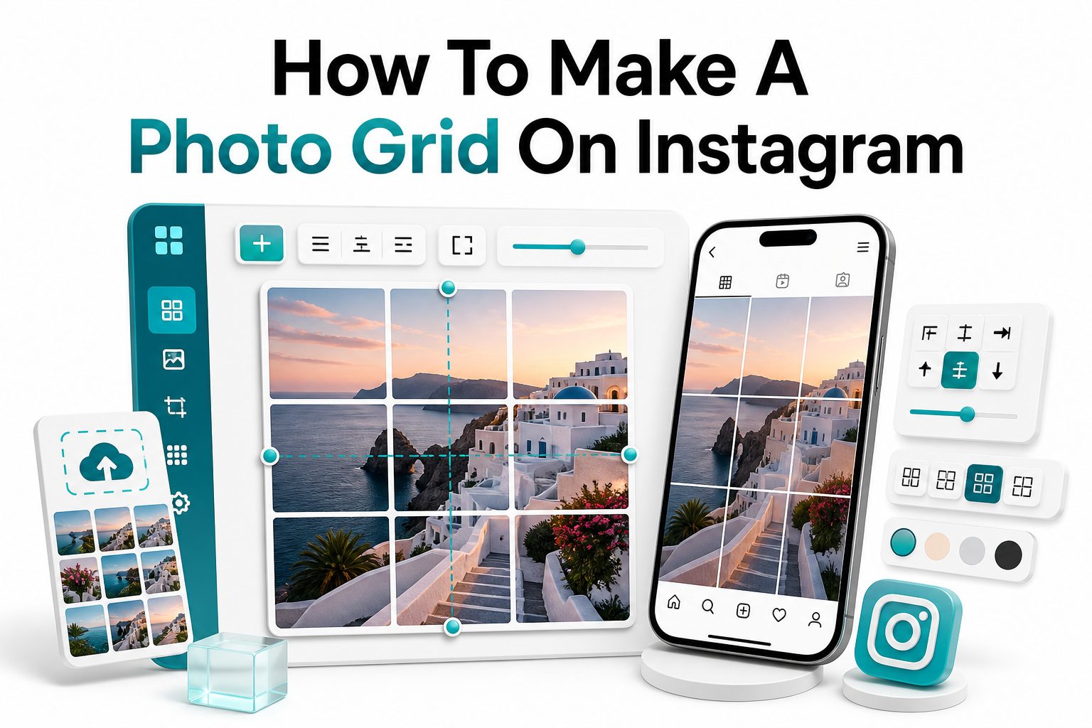
Want your Instagram profile to look more polished the moment someone lands on it? A photo grid can help you turn separate posts into one larger visual layout, making your feed feel more intentional, creative, and memorable. Whether you are a creator, small business owner, photographer, coach, or casual user, learning how to make a photo grid on Instagram gives you more control over how your profile tells a story.
A photo grid can be as simple as one image split into three posts or as planned as a full nine-post layout with branding, text, colors, and product shots. The key is not just cutting an image into pieces. It is choosing the right photo, sizing it correctly, posting in the right order, and making sure every tile still works on its own. This guide walks you through the process clearly, with practical tips you can use right away.
What an Instagram Photo Grid Is
An Instagram photo grid is a layout where multiple feed posts work together visually when viewed on your profile. The most common style is one large image divided into 3, 6, 9, or 12 square posts, creating a single picture across your profile grid.
Some grids use one continuous photo, while others combine images, graphics, quotes, product shots, and brand colors. A strong grid feels planned without looking stiff. Each post should still make sense in the feed because most people see individual posts before visiting your profile.
Why Photo Grids Still Work on Instagram
Instagram has changed a lot, but the profile grid still matters. When someone checks your account, your first few posts quickly communicate your style, niche, and level of care. A clean grid can make your brand feel more established in seconds.
Photo grids are especially useful for launches, campaigns, announcements, portfolios, and themed content. They can highlight a new product, reveal a collection, or create a visual story. Used wisely, they help your profile stand out without relying only on captions or Reels.
Key benefits of using an Instagram photo grid:
- Makes your profile look more professional and intentional
- Helps promote launches, events, products, or announcements
- Creates stronger visual branding across several posts
- Encourages profile visits and browsing
- Gives photographers, designers, and creators a portfolio-style layout
- Adds variety to your usual feed content
- Helps tell a bigger story through connected visuals
Choose the Right Grid Layout
Before editing anything, decide how many posts your grid will use. A 3-post grid works well for banners and quick announcements. A 6-post grid gives more vertical space, while a 9-post grid creates the classic full square image across your profile.
For most users, a 3 or 9-photo layout is easiest to manage. Larger grids can look impressive, but they also require more planning. If you post often, remember that new posts will push the grid down and eventually break the first-view effect.
Pick a Strong Image or Design
The image you choose matters more than the app you use. A wide landscape photo, product campaign image, collage, or branded design can work well. Avoid images where important faces, text, or product details fall directly on grid cuts.
If you are creating a business grid, use consistent colors, fonts, and spacing. Keep text large enough to read after the image is split. For inspiration on planning branded visuals, you can visit [Internal Link: Instagram content planning] before designing your layout.
Photo grid layout comparison:
Layout Type | Best For | Difficulty | Main Advantage
3-post grid | Banners, announcements, launches | Easy | Quick to create and post
6-post grid | Product highlights, event promotions | Medium | More room for details
9-post grid | Portfolio reveals, campaigns, big visuals | Medium | Strong profile impact
12-post grid | Editorial layouts, large brand campaigns | Advanced | Highly visual storytelling
Use the Correct Instagram Grid Size
Instagram feed posts commonly use square, portrait, and landscape formats, but photo grids are usually based on square tiles. For a clean 3-column grid, each tile should be 1080 x 1080 pixels. A 3-by-3 grid should start from a 3240 x 3240 pixel design.
If you use a smaller image, the split posts may look blurry after uploading. Start with a high-resolution image whenever possible. Good sizing keeps edges sharp, text readable, and details clear across every tile in your finished Instagram layout.
Prepare Your Design Before Splitting
Open your photo or design in a tool like Canva, Photoshop, Adobe Express, or a mobile editing app. Set the canvas size based on your chosen grid. For example, use 3240 x 3240 pixels for a nine-post square grid.
Place your most important visual elements away from the cut lines. Faces, logos, calls to action, and product names should sit comfortably inside one tile or span sections carefully. This prevents awkward cropping when the image becomes individual Instagram posts.
Pre-split checklist:
- Use a high-resolution image or design
- Choose 3, 6, 9, or 12 posts before editing
- Keep important text away from tile borders
- Make sure each square can work as an individual post
- Check that colors match your current feed
- Save an original copy before splitting
- Preview the layout before uploading to Instagram
How to Split a Photo for Instagram
To split a photo, use a grid maker app or design tool that exports separate square tiles. Popular options include Canva, PhotoSplit, Grid Maker, Preview, Planoly, and Adobe Express. Many tools let you choose the exact grid format before exporting.
After exporting, the app usually saves each tile in the correct posting order. Check the file names carefully. If the order is unclear, place the tiles into a planning app first so you can see how they will appear on your Instagram profile.
Post the Grid in the Correct Order
Instagram places your newest post in the top-left position of your profile grid. That means you must upload the split images in reverse order. For a 3-by-3 grid, post the bottom-right tile first and the top-left tile last.
This step is where many grids go wrong. If you upload the tiles in normal reading order, the final profile image will look scrambled. Before posting, preview the full grid in a scheduling tool or your camera roll arrangement.
Posting order for a 3-by-3 grid:
- Post tile 9 first
- Post tile 8 second
- Post tile 7 third
- Post tile 6 fourth
- Post tile 5 fifth
- Post tile 4 sixth
- Post tile 3 seventh
- Post tile 2 eighth
- Post tile 1 last
Write Captions for Each Grid Tile
Even though the grid creates one big picture on your profile, every tile is still a separate post. Each caption should make sense alone. Avoid writing captions that only say “part 1” or “keep watching,” because users may see the posts separately in their feed.
Use captions to support the visual story. For a product launch, each tile can share one benefit, feature, or detail. For a personal brand, each post can explain one idea connected to the larger theme. This keeps engagement stronger across all posts.
Add Hashtags and Alt Text
Hashtags still help with categorization when used carefully. Choose a mix of niche, content-specific, and audience-focused hashtags. A photo grid about travel photography should use different tags than a grid promoting a skincare launch or online course.
Alt text is also useful for accessibility and search context. Describe what appears in each tile clearly, especially if the grid contains products, people, locations, or important design elements. Good alt text helps users who rely on screen readers understand the image.
Caption and optimization tips:
- Give every tile a complete caption
- Use a natural call to action where useful
- Avoid repeating the same caption nine times
- Add alt text that describes each image tile
- Use hashtags that match the post, not only the grid
- Tag relevant products, people, or locations
- Keep promotional language clear and direct
Use a Planning App to Preview the Grid
A planning app helps you see your feed before publishing. Tools like Later, Preview, Planoly, and Metricool let you drag posts into order and check how the grid will look. This reduces mistakes and saves time during upload.
Previewing is especially important if you mix grid posts with regular content. You can test whether upcoming Reels covers, carousel posts, or single images will interrupt the pattern. A little planning keeps your profile from looking accidental after the grid goes live.
Maintain Your Feed After Posting
Once your grid is posted, new content will push it down your profile. That is normal, but it means a photo grid is usually best for a specific campaign or moment. Do not build your entire content strategy around keeping one grid fixed forever.
If you want a consistent profile over time, combine grids with reusable visual rules. Use similar colors, crop styles, backgrounds, or templates. This lets your feed stay polished even after the original grid moves lower on the page.
Simple feed maintenance checklist:
- Plan your next three posts before publishing the grid
- Use matching cover images for Reels
- Avoid posting unrelated visuals immediately after a campaign grid
- Archive old grid tiles only if they no longer serve your brand
- Keep important announcements pinned when appropriate
- Review your profile on mobile after posting
- Update your bio link if the grid promotes an offer
Best Apps for Making Instagram Photo Grids
Canva is one of the easiest tools because it lets you design at exact sizes, add text, use brand assets, and export clean images. You can create a 3240 x 3240 canvas, design the full image, then use a splitter tool afterward.
PhotoSplit and Grid Maker are faster for simple image splitting. They are useful when you already have a finished image and only need to divide it. For a more strategic workflow, planning tools like Later or Planoly help you preview and schedule the finished posts.
Common Photo Grid Mistakes to Avoid
One common mistake is using too much text across the full image. Once the design is split, words may land awkwardly across tile borders. If text is necessary, place it in clear blocks that remain readable as individual posts.
Another mistake is posting too many grid campaigns too often. Grids can look impressive, but followers may see several disconnected image fragments in their feed. Use grids for special moments, then return to valuable standalone content that serves your audience.
Tool selection tips:
- Use Canva for designed grids with text and branding
- Use Photoshop for advanced editing and precise control
- Use PhotoSplit for quick mobile splitting
- Use Preview or Planoly to check posting order
- Use Later or Metricool for scheduling campaigns
- Use Adobe Express for simple branded templates
- Test one small grid before planning a larger one
Creative Instagram Photo Grid Ideas
A product reveal is one of the best uses for a grid. You can split a hero product image into nine tiles, then use captions to explain the launch date, features, pricing, or benefits. This works well for fashion, beauty, food, and digital products.
Creators can use grids for portfolio moments. A photographer might show one striking image across nine tiles, while a designer could create a campaign board with logos, colors, and project previews. For more visual strategy ideas, see [Internal Link: social media branding tips].
Photo Grid Ideas for Businesses
Businesses can use photo grids to promote seasonal offers, new collections, event dates, or service packages. A clean grid can make a launch feel bigger without needing a large ad budget. It also gives your profile a temporary campaign-focused look.
Service-based brands can use grids to explain an offer visually. For example, a fitness coach might create a grid with transformation photos, program details, and client results. Each tile can support one message while still forming one cohesive profile image.
Business grid examples:
- New product launch reveal
- Seasonal sale announcement
- Event countdown layout
- Service package breakdown
- Brand refresh reveal
- Customer testimonial collage
- Portfolio highlight board
- Course or webinar promotion
How to Make a 3-Post Instagram Grid
A 3-post grid is the simplest option. Start with an image or design sized at 3240 x 1080 pixels. Split it into three equal 1080 x 1080 squares. This creates a horizontal banner across one row of your Instagram profile.
Post the right tile first, the middle tile second, and the left tile last. This reverse order makes the banner appear correctly from left to right on your profile. A 3-post grid is ideal when you want impact without flooding followers with many posts.
How to Make a 9-Post Instagram Grid
For a 9-post grid, create a square canvas at 3240 x 3240 pixels. Design the full image, then split it into nine equal squares. Each square should measure 1080 x 1080 pixels for the best Instagram feed quality.
Upload the tiles in reverse order, beginning with the bottom-right image and ending with the top-left image. Before publishing, double-check the arrangement in a planning app. A 9-post grid looks strong, but one tile posted incorrectly can ruin the full layout.
Quick size guide:
Grid Format | Full Design Size | Tile Size | Number of Posts
1 row | 3240 x 1080 px | 1080 x 1080 px | 3
2 rows | 3240 x 2160 px | 1080 x 1080 px | 6
3 rows | 3240 x 3240 px | 1080 x 1080 px | 9
4 rows | 3240 x 4320 px | 1080 x 1080 px | 12
How to Keep Each Tile Engaging
The best grids work both as a whole and as separate posts. Each tile should have enough visual interest to stand alone in the feed. This might mean a product close-up, a strong texture, a person’s face, a bold headline, or a useful caption.
Think about the user who never visits your profile. Will that single tile still feel worth liking, saving, or reading? If the answer is no, adjust the design. Strong individual posts help your grid perform better beyond the profile view.
Use Carousels With Your Grid Strategy
Carousels can support a grid campaign without overloading your feed with fragments. For example, after posting a 3-tile banner, you can publish a carousel explaining the offer in more detail. This gives followers something useful to swipe through.
You can also use the first slide of each carousel as part of the grid. The remaining slides can include tips, product details, examples, testimonials, or behind-the-scenes content. This approach keeps your profile beautiful while making each post more valuable.
Engagement tips for grid tiles:
- Give each tile a clear subject or focal point
- Use captions that provide value on their own
- Add carousel slides for deeper information
- Keep calls to action specific and simple
- Pin the most important grid post if needed
- Avoid posting blank or nearly empty tiles
- Use strong covers for Reels around the grid
When Not to Use an Instagram Photo Grid
A photo grid is not right for every situation. If you post daily news, fast updates, memes, or casual personal content, a strict grid may feel limiting. It can also make spontaneous posting harder because every new post shifts the layout.
Avoid grids when each tile would look confusing by itself. Followers may see isolated corners, cropped text, or partial faces in their home feed. If the individual posts are weak, the grid may hurt engagement even if the profile view looks attractive.
Measure How Your Grid Performs
After posting your grid, review performance through Instagram Insights. Look at reach, profile visits, saves, shares, comments, and follows. A good grid should not only look nice; it should support a real goal, such as launching a product or attracting inquiries.
Compare grid posts with your usual content. If profile visits rise but engagement drops, the visuals may be strong while the individual posts need better captions. If saves and shares increase, your grid likely delivered value as well as visual appeal.
Performance metrics to check:
- Profile visits after the grid goes live
- Follower growth during the campaign
- Reach on each individual tile
- Saves and shares per post
- Comments and direct messages
- Website clicks or bio link taps
- Product tags or shop activity
- Carousel swipe-through rates if used
Conclusion
A well-planned Instagram photo grid can make your profile feel more polished, intentional, and memorable. The process is simple once you know the basics: choose the right layout, prepare a high-resolution design, split it into equal tiles, post in reverse order, and make sure every post has its own value.
The strongest grids are not only attractive from the profile view. They also work in the feed, support a campaign, and give followers a reason to engage. Use grids for launches, creative reveals, portfolio moments, and brand storytelling, then balance them with regular posts that keep your audience interested. When you know how to make a photo grid on Instagram, you can turn your feed into a stronger visual asset without making your content strategy overly complicated.
FAQ
Can I make an Instagram photo grid without an app?
Yes, but an app makes it easier. You can design the full image in Canva or Photoshop, crop it manually into equal squares, and upload each tile in reverse order so the profile grid displays correctly.
What is the best size for an Instagram photo grid?
For square grid posts, use 1080 x 1080 pixels per tile. A 3-by-3 grid should start as a 3240 x 3240 pixel design to keep the final posts sharp and properly aligned.
Will a photo grid affect my Instagram engagement?
It can help or hurt depending on execution. If each tile looks useful and interesting alone, engagement can stay strong. If followers see confusing fragments in their feed, likes, comments, and saves may drop.
How do I post a grid in the right order?
Post the last tile first and the first tile last. For a 9-post grid, start with the bottom-right square and finish with the top-left square so the full image appears correctly on your profile.
Can I use Reels in an Instagram photo grid?
Yes, but use custom Reel covers that match your grid design. The cover image is what appears on your profile, so it must align visually with the surrounding posts to keep the layout clean.
0 Comments